Give a music visualizer a visual idea before choosing a model
A music visualizer does not need a new spectacular image for every beat. It needs a relationship between sound, movement, and repetition that remains interesting over time. A useful Viddo AI workflow starts by deciding what the viewer should recognize, how that idea changes, and which parts of the music deserve visual emphasis. Model selection comes after those decisions because different shots demand different strengths.
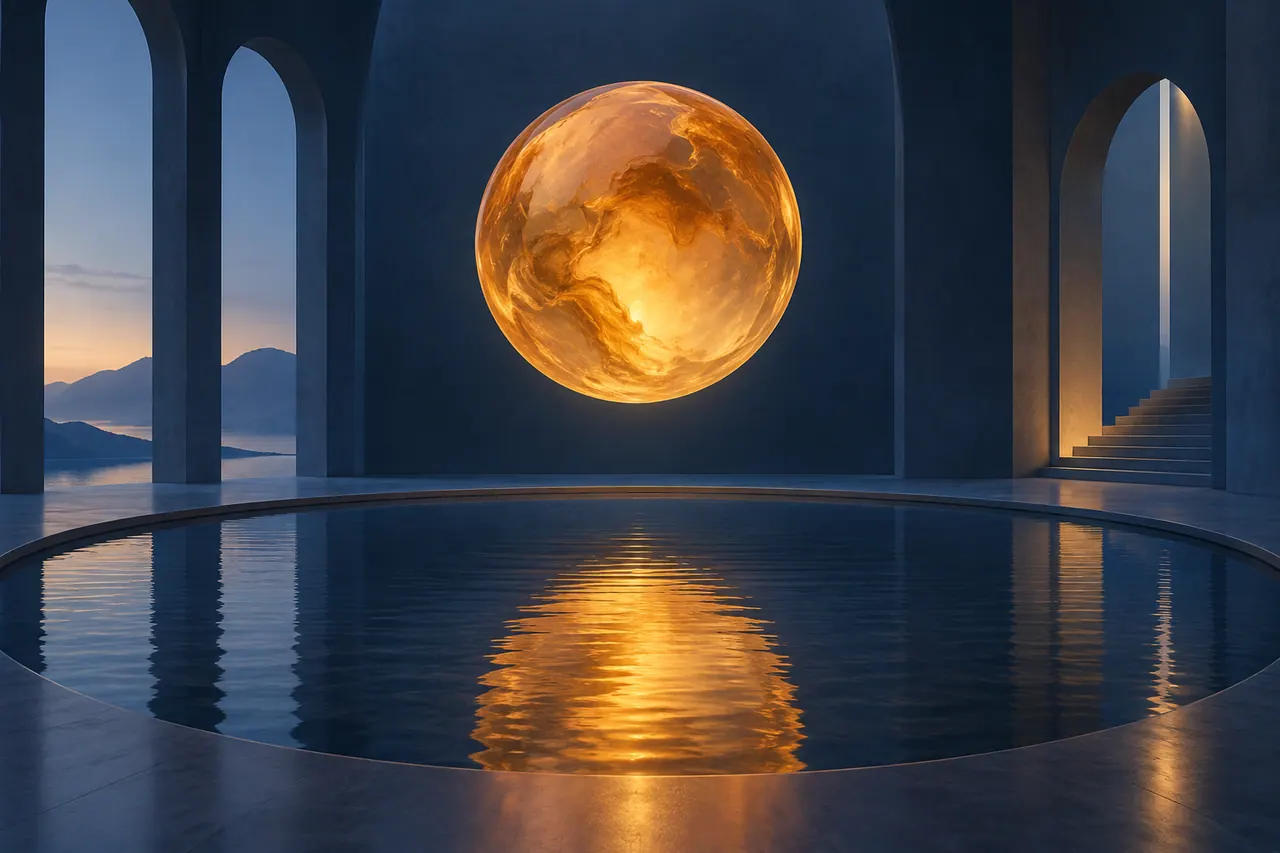
This guide develops an original fictional instrumental called Intervals of Blue. The production exercise assumes a finished track at ninety six beats per minute in four four time, with thirty two bars and a running time of eighty seconds. These are planning values for an invented composition, not a claim about a generated recording. The visual motif is an amber disc seen through changing architectural spaces.
The disc first appears as a small point in a deep blue room. Reflections multiply it across a shallow pool. Translucent fabric briefly obscures it. The final section reveals an open space where the disc becomes part of a wider composition. The visualizer has development without requiring a literal story, a character performance, or a sequence of unrelated fantasy worlds.
Viddo's official website presents image and video generation workflows and access to multiple creative models. This article offers an independent method for planning, comparing, and editing outputs. Confirm current model availability, supported inputs, duration choices, and export settings in the service. No particular model is assumed to guarantee synchronization, continuity, or a usable result without review.
Establish the finished audio as the timing reference
Begin with a stable audio master before making precise visual decisions. If the arrangement, tempo, or ending continues to change, tightly timed edits will need repeated repair. Keep an exploratory version of the music separate from the version approved for visual production. Give the approved file a clear name and record its duration and sample rate in the project notes.
For Intervals of Blue, imagine a soft pulse, a plucked melodic figure, a warm bass entry, and a sustained closing texture. The music contains no vocals in this exercise. That choice leaves the visualizer free to develop abstract imagery without competing with a lyric narrative. A vocal track would require additional decisions about whether the imagery supports, contrasts with, or deliberately avoids the words.
Listen to the track several times without generating anything. Mark where a new instrument enters, where intensity changes, where a phrase resolves, and where silence or decay matters. These events often make better edit points than every individual beat. The visual rhythm should follow the composition's meaningful changes rather than mechanically responding to the waveform's largest peaks.
If the music is generated, review its rights and provenance before planning public distribution. If it is composed or recorded by a person, keep the relevant permissions and credits with the project. The production method works with either source, but the finished visualizer needs a clear account of the audio it uses and the version that defines its timing.
Translate tempo into an editable map
At ninety six beats per minute, one beat lasts six tenths plus one fortieth of a second, or zero point six two five seconds. A four beat bar therefore lasts two and a half seconds. Eight bars last twenty seconds, and thirty two bars last eighty seconds. These simple relationships give the editor a reliable starting grid for the fictional track.
The grid is a planning aid, not a requirement to cut on every bar. Divide the track into four eight bar sections: introduction, development, interruption, and release. Mark the section boundaries at zero, twenty, forty, sixty, and eighty seconds. Then add the musical events heard within those sections. A bass entry at ten seconds may matter more visually than a routine bar line.
Set the editing sequence's frame rate before making frame precise decisions. At twenty four frames per second, the assumed beat length corresponds to fifteen frames and a bar to sixty frames. At another frame rate, some beat positions may fall between frames. Place edits on the nearest suitable frame while listening, rather than assuming the same numerical frame spacing works in every sequence.
Verify the grid against the actual audio. A live performance, tempo drift, pickup note, or exported silence at the beginning can shift the relationship. Even a track described as ninety six beats per minute may not begin exactly on the first downbeat. The waveform and listening pass determine the real alignment; arithmetic supplies an organized hypothesis to check.
Define a motif that can survive variation
The amber disc is the visualizer's recognition anchor. It has a warm translucent appearance, a clean circular outline, and a stable relationship to the surrounding blue environment. It does not need to occupy the same position in every shot, but its essential identity should remain recognizable. Without an anchor, a multi model production can become a collection of attractive but disconnected clips.
Specify the disc's visual rules. It is neither a sun nor a branded object. It emits a soft internal glow rather than a sharp spotlight. Its edge remains smooth, and it does not turn into a face, a planet, or a clock. These constraints protect the abstract idea while allowing composition, scale, and reflections to change.
Choose secondary motifs carefully. A circular opening, a curved shadow, and a ripple can echo the disc without repeating it literally. Their recurrence gives the visualizer structure. Adding birds, machinery, flowers, and futuristic vehicles would introduce additional visual languages that the short piece may not have time to develop.
Create a reference sheet with the motif in several approved compositions. Include a close view, a distant view, and a reflection. Record what remains constant and what may vary. This sheet gives image generation and video generation a shared target. It also makes model comparisons fairer because each candidate is being asked to preserve the same central idea.
Build a palette that changes by degree
Use a limited palette for the first version: deep blue, amber, pale gray, and a restrained warm white. Let the proportion of these colors evolve across the four sections. The introduction can be mostly blue with a small amber point. The development can increase reflected amber. The interruption can soften both colors through fabric. The release can introduce more open light.
Describe materials as clearly as colors. Matte walls, translucent glass, shallow water, and thin fabric each interact with light differently. The material vocabulary gives the generation process more direction than a request for a cinematic abstract atmosphere. It also helps the reviewer identify drift, such as a glass disc becoming metallic or water behaving like polished stone.
Do not change every visual property at once when the music grows. Increasing brightness, camera speed, object count, contrast, and saturation simultaneously can make the sequence feel disconnected from its opening. Choose one or two dimensions of change for each section. The music can become fuller while the camera remains slow and the reflection pattern becomes more complex.
Save a few approved still frames as color references for the final edit. Models may produce different interpretations of the same blue and amber prompt. A later grade can bring compatible shots closer together, but it cannot easily repair fundamentally different lighting logic. Select outputs that already belong to the same visual world before relying on postproduction matching.
Plan four sections with different visual functions
The introduction establishes the motif and gives the audience time to notice it. A wide room, a small glowing disc, and a slow approach can occupy the first twenty seconds through several measured shots. The purpose is recognition, not maximum intensity. Leave some empty space so later changes have somewhere to go.
The development introduces relationships. The disc reflects in shallow water, and a second angle reveals how the reflection connects to the original. The music's fuller arrangement can correspond to a denser composition. The viewer should still understand which object is real within the scene and which is a reflection, even though the world itself is abstract.
The interruption uses translucent fabric to partially hide the disc. This creates a change in visibility rather than a new protagonist. If the music briefly thins, a more static shot can make the interruption feel intentional. The fabric's movement should remain restrained enough that the disc's return becomes the important event.
The release opens the composition. The camera can reveal a larger architectural space or a view toward a pale sky, while the amber disc remains present. The ending should feel like a development of the opening rather than a random new destination. A final held frame can let the musical decay finish and give the visualizer a deliberate stopping point.
Choose image to video or text to video by shot needs
Image to video is useful when the starting composition and motif shape matter strongly. An approved still can establish the exact disc, room proportions, and palette before motion is introduced. The motion prompt then focuses on camera movement, light, reflection, or fabric. This separates composition design from temporal behavior and makes failures easier to diagnose.
Text to video can be useful for exploring a looser environmental idea or a movement that does not depend on a precise source frame. For example, a slow passage through an empty blue corridor may serve as a transitional shot. Review whether its materials and light belong to the established world before accepting it simply because the camera movement is attractive.
Do not choose the workflow based only on which button is fastest to reach. Ask which properties must remain fixed and which may be discovered through generation. A hero shot of the amber disc has stricter continuity requirements than a brief abstract reflection insert. Assign the more controlled workflow to the shot with the greater identity burden.
Keep a fallback for every important moment. If the reflection shot cannot preserve the disc, use an approved still with a subtle editorial move or a simpler angle. If fabric motion becomes chaotic, cut to a static translucent panel. The visualizer's structure should remain achievable even when one generation method fails to produce the imagined result.
Create a small model comparison instead of a popularity contest
A useful model comparison asks which available option best serves a particular shot. It does not try to declare a universal winner from a few attractive samples. For Intervals of Blue, compare candidates on three tasks: stable geometric camera movement, coherent water reflection, and restrained fabric motion. Each task exposes different requirements.
Use the same approved reference image and a shared core prompt where the models support comparable inputs. Record differences in available settings instead of pretending the interfaces are identical. One model may offer a duration or reference control another lacks. Those differences are part of the practical comparison, but they should not be confused with pure output quality.
Generate a limited number of candidates for each task and review them against criteria written in advance. Does the disc stay circular? Does the reflection remain connected to the object? Does the camera move smoothly? Is there a clean usable interval? These questions are more informative than a general rating of how cinematic a clip feels.
Report the comparison as a project decision. Model A may be selected for the room shot and Model B for fabric, with their actual names recorded in the production ledger. This guide uses generic labels because availability changes and no measured test is being reported here. The method helps creators make their own evidence based choice with the models currently accessible to them.
Make comparison prompts specific and portable
The shared core prompt should describe the desired scene and behavior without relying on settings unique to one interface. For the room task, specify an amber translucent disc suspended in a matte blue room, a slow forward camera movement, stable geometry, and soft light. Add model specific controls separately and document them so the comparison remains interpretable.
An example motion prompt is: The camera moves slowly forward through a quiet deep blue architectural room toward one suspended amber glass disc. The disc remains circular and steady, with a gentle internal glow. Walls and floor stay rigid. Lighting is constant. No additional objects appear. The movement is continuous and restrained, leaving a stable moment near the end.
For the reflection task, replace the camera instruction with a low lateral move beside shallow still water. Ask for the disc's reflection to remain spatially connected and for only small surface ripples. Do not add dramatic waves, changing weather, or a spinning camera unless those are the actual variables being tested. A controlled prompt makes the result easier to evaluate.
Record the submitted prompt exactly, including any interface settings that affect output. A paraphrased memory is not enough to reproduce a useful comparison. Save the source image and output alongside the notes. The goal is not perfect determinism but a clear account of what was requested, what changed, and why one candidate was preferred for the edit.
Review temporal behavior beyond the first frame
A still thumbnail can hide the defects that matter most in a visualizer. Watch the entire candidate at normal speed, then inspect the beginning, middle, and ending. Look for the disc's outline drifting, walls breathing, reflections disconnecting, or fabric turning into a different material. The clip needs a usable span of time, not just one striking image.
Mark clean intervals in the asset ledger. A six second generation might contain three seconds that fit the project. That can still be useful if the planned shot is short enough and the edit has a natural entry and exit. Do not reject a candidate solely because it is imperfect outside the portion the final sequence needs.
Also record the direction and speed of movement. A slow leftward drift can cut smoothly to another leftward movement, while an abrupt reversal may feel like a mistake unless the music motivates it. Temporal continuity includes the viewer's sense of motion across edits, not only the stability of objects within a single clip.
Watch candidates with the intended music section. A technically smooth shot can feel too busy during a sparse passage, and a nearly static shot can work beautifully when the sound supplies movement. Selection belongs to the audiovisual relationship. The strongest isolated clip is not always the strongest choice for the sequence in which it must function.
Allocate generation effort according to editorial importance
Not every shot deserves the same number of attempts. The opening motif, the section transitions, and the final frame carry more structural weight than a brief reflection insert. Identify these anchor shots before spending heavily on exploration. Approving them early gives the rest of the sequence a stable visual framework.
Set a practical candidate limit for each task based on the project's resources. After several failures of the same kind, change the shot design rather than repeating the identical request indefinitely. A complex reflection may need a simpler composition. A long camera move may need to become two shorter shots. The creative problem can often be solved editorially instead of through another generation.
Track effort in terms of usable seconds and production decisions, not just the number of files produced. Ten clips that cannot enter the edit provide less value than one simple shot that resolves a difficult transition. This way of thinking keeps experimentation connected to the finished visualizer rather than to the excitement of producing new candidates.
Preserve a small exploration allowance for discoveries. An unexpected shadow or reflection can suggest a useful visual idea. But evaluate it against the motif and music map before expanding the project around it. A discovery earns its place when it improves the sequence, not merely because it is surprising or technically impressive.
Assemble the music map before the visual polish
Place the approved audio master on the editing timeline and add markers for sections, phrases, and major events. Use temporary stills or color cards to represent the planned visual functions. The introduction card might say establish disc, while the development card says reflection relationship. This rough map tests the overall pacing without requiring finished clips.
Insert approved candidates where they serve those functions. Let the music guide whether a shot should hold longer or change earlier. Avoid filling every empty interval with another generation simply because the timeline looks sparse. An image held through a meaningful musical phrase can create anticipation and give the next change more impact.
Review the sequence from beginning to end after each major assembly change. A locally satisfying cut can disrupt the larger development. If the reflection appears too early, the second section may have nothing new to reveal. If the open sky appears before the interruption, the ending may feel like a return instead of a release.
Keep the rough edit visually plain. Simple cuts are enough to evaluate structure. Elaborate transitions can conceal a weak relationship temporarily but make later timing changes more difficult. Once the sequence works with basic edits, choose where a dissolve, match cut, or graphic transition genuinely supports the music and the visual idea.
Cut to phrases rather than reacting to every beat
A beat grid can tempt an editor into predictable repetition. If every beat causes a cut, the viewer may stop noticing changes because all moments receive the same emphasis. Use the grid to understand timing, then choose a hierarchy. Section changes can receive the largest visual shifts, phrase endings smaller changes, and individual beats occasional accents.
For the first twenty seconds of Intervals of Blue, one shot might hold for two bars, another for four, and a final closer view for two. This gives the introduction a measured pace. The development could use shorter views around a new instrumental entry while retaining a longer reflection shot as its center. The exact durations should follow the actual recording.
Consider cutting just before a musical event so the new image has time to register, or just after it so the sound seems to motivate the change. Both can work. Listen and watch instead of treating the downbeat as the only legal cut position. Small offsets can change whether an edit feels anticipatory, responsive, or abrupt.
Reserve fast cutting for a reason. A brief cluster of short reflection inserts can emphasize a rhythmic detail, but the return to a longer shot gives the contrast meaning. Constant speed leaves little room for development. The visualizer becomes more expressive when its pacing has the same capacity for space and emphasis as the music.
Use internal motion to carry rhythm between cuts

Rhythm can come from movement within a shot. A reflection passing behind a column, fabric crossing the disc, or light reaching a curved wall can align with a musical phrase without requiring a cut. These internal events often create a calmer and more integrated visualizer than rapid editing alone.
Generated movement may not land exactly on the desired beat. Identify the useful event in the clip and position it on the timeline first. Then assess whether the available beginning and ending fit the surrounding shots. This event centered editing approach can be more effective than placing the clip's first frame at a marker and hoping the action lines up.
Use retiming carefully. A modest speed adjustment may help an event meet the music, but large changes can make fabric or water feel unnatural and may reveal interpolation artifacts. Review the result at full playback quality. If the movement becomes distracting, choose a different interval or revise the edit rather than forcing the shot into a timing it cannot support.
Avoid claiming that a prompt alone guarantees beat synchronization. Timing is an editorial responsibility in this workflow. Even if a selected tool offers audio related controls, the final output still needs to be checked against the approved master. The viewer experiences the finished alignment, not the intention recorded in the prompt.
Create match cuts from shape and position
The amber disc gives the editor several opportunities for meaningful match cuts. A circular object in one shot can connect to a circular opening in the next. A reflection near the lower left can lead to a pale disc in the same region of a different composition. These relationships create continuity even when the location changes.
Plan the match before generating the second image. Record the disc's approximate size and position in the outgoing frame, then use that information in the next composition brief. Exact pixel matching is not always necessary, but a clear visual relationship helps the cut feel deliberate. Large accidental shifts can make the viewer search for the motif again.
A match cut should also respect motion. If the camera approaches the disc in one shot, a sudden retreat in the next changes the felt direction. That may be appropriate at the interruption, but it should be intentional. Shape, position, scale, and movement work together to create the transition.
Keep some transitions simple. If every cut announces its cleverness, the visualizer can become a demonstration of editing tricks rather than a companion to the music. Use the strongest matches at section boundaries or important phrases. Let ordinary cuts handle the rest so the notable transitions retain their expressive value.
Make looping decisions before the ending is locked
A visualizer may be watched once as a complete piece or repeated as a background loop. Decide which experience matters most. A complete musical ending can support a held final frame and a gentle fade. A seamless loop requires attention to both the audio boundary and the visual relationship between the final and first frames.
For Intervals of Blue, the primary version is a complete eighty second piece. The final open composition can return the disc to a position related to its opening location, but the music's decay is allowed to finish. This creates a sense of closure without pretending that the sequence is perfectly seamless when replayed.
A separate short loop could use a stable reflection passage from the middle section. Inspect the movement direction, brightness, and water pattern at the boundary. A dissolve may soften the transition but can create a ghosted double disc. Review the loop repeatedly rather than assuming a short crossfade makes any pair of frames continuous.
Do not reverse a clip automatically to create a back and forth loop if the motion becomes implausible. Water, fabric, and camera acceleration can reveal the reversal. A simpler static composition with restrained movement may produce a more convincing loop. The best choice depends on what the selected interval actually contains, not on a generic looping recipe.
Add titles as part of the composition
The track title and artist credit should be designed into the visualizer rather than placed over the most important imagery at the last moment. The introductory blue room provides negative space for Intervals of Blue. The final open composition can carry a small closing credit if the distribution context requires it. Keep the disc visible while the text appears.
Use approved typography in the editing or design stage. This gives control over spelling, kerning, alignment, and animation. Avoid asking a video generation model to maintain small precise text across moving frames when a straightforward title layer can do the job reliably. The imagery and typography should each use the production method suited to their role.
Check the title at the smallest intended viewing size. Fine pale lettering may look elegant on a large monitor and disappear on a phone. Maintain sufficient contrast and allow enough screen time to read it comfortably. A short visualizer does not need a long sequence of production credits before the music has established its mood.
If creating a text free version for reuse, preserve the clean master separately. A title card may be appropriate for a release video but unnecessary for a live background display or an embedded player with surrounding metadata. Keeping the title layer editable allows the same approved visual sequence to serve these contexts without regenerating the artwork.
Protect the music from unnecessary added sound
An instrumental visualizer usually does not need every visible movement to make a sound. Adding water splashes, fabric rustles, and cinematic impacts can compete with the composition. The amber disc and architectural spaces are a visual interpretation of the music, so they can remain acoustically silent unless a deliberate sound design concept says otherwise.
If a video model produces audio with its output, decide whether to mute it before assembly. Do not let incidental generated sounds enter the final mix unnoticed. A quiet hum or sudden effect can alter the track's balance even when it is barely audible during editing. The approved music master should remain the reference for the release.
Check that the final export has not changed the music's start, ending, or channel balance. Listen through the complete file, including the final decay. An extra frame of black is less serious than a clipped final note, but both can make the release feel unfinished. Export verification belongs to the creative process because the audience hears the exported file.
Retain the original audio master separately from any version processed for a particular platform. Different delivery contexts may have different technical requirements. Confirm those current requirements when preparing the release rather than applying remembered settings indiscriminately. The important principle is to know which file is the source and which is a destination specific derivative.
Match outputs without erasing their useful differences
Clips from different models may differ in contrast, sharpness, texture, and motion character. Start by selecting compatible candidates rather than expecting a final grade to solve everything. A soft architectural shot and an extremely glossy high contrast shot may remain visibly different even after their colors are adjusted to the same palette.
Use a small set of reference frames to guide matching. Compare the depth of the blue, the brightness of the amber disc, and the neutrality of pale surfaces. Make restrained corrections while watching adjacent shots in sequence. A technically identical color value is not always the best perceptual match when the lighting and composition differ.
Avoid excessive sharpening or texture overlays intended to force every clip into one surface treatment. These can amplify artifacts and make motion less comfortable to watch. If a shot requires heavy correction to fit, reconsider whether it belongs in the sequence. A simpler compatible image may serve the piece better than a spectacular outlier.
Preserve purposeful differences between sections. The interruption may be softer because fabric obscures the scene. The release may be brighter because the architecture opens. Matching should remove accidental inconsistencies while retaining the development planned in the visual brief. The goal is a coherent journey, not a flat sequence in which every frame has exactly the same appearance.
Review comfort, clarity, and accessibility
Watch the visualizer at its intended size and at full screen. Rapid brightness changes, aggressive camera movement, or dense flickering reflections can become uncomfortable even when individual frames look appealing. Reduce unnecessary flashing and review any rhythmic light effect carefully. A music visualizer should support sustained viewing rather than demand constant visual strain.
Ensure that the core motif remains understandable without relying exclusively on subtle color differences. Shape, position, and movement can reinforce the amber and blue relationship. This also helps when the video is viewed on a dim display or in a compressed preview. A clear composition tends to survive varied viewing conditions better than one dependent on delicate color separation alone.
Provide useful descriptive text when publishing still thumbnails or embedding the visualizer in a page. Describe the suspended amber disc and blue architectural spaces rather than filling the alt text with repeated AI video generator keywords. Surrounding page copy can explain the Viddo AI workflow, model comparison method, and original music concept in readable language.
If the release includes lyrics or spoken material in a future version, plan captions or an accessible transcript appropriate to the content. The current exercise is instrumental, so it does not invent words that are absent from the music. Accessibility decisions should follow what the work actually contains and how people will encounter it.
Keep a comparison ledger that future projects can use
Record the model, input method, source image, prompt, settings, output duration, and selected interval for every clip used in the final piece. Add a short note about the task it served and any correction applied. This ledger turns a multi model experiment into reusable production knowledge rather than a folder of mysterious exports.
Separate observation from conclusion. An observation might say the disc remained stable for the selected three seconds while the reflection distorted afterward. The conclusion might be that the clip is usable as a short insert but unsuitable for a long hold. This distinction keeps the record honest and prevents a narrow success from becoming an exaggerated claim about a model's general reliability.
Save rejected examples selectively when they illustrate a meaningful failure. A geometry drift example can help define a better test next time. There is no need to retain every near duplicate indefinitely, but the project should preserve enough evidence to explain its decisions. A concise review history is more useful than either total deletion or an unorganized archive.
When model versions or available controls change, run a small new comparison instead of assuming the previous result still applies. The stable parts of the workflow are the musical map, visual criteria, and review method. The best available generation choice can change while those production principles continue to guide a clear decision.
Solve a difficult transition with a short edit exercise
Suppose the approved reflection clip ends with the disc near the lower right, while the fabric clip begins with it centered. A direct cut feels like an accidental jump during a quiet phrase. Before generating another expensive shot, duplicate that small section of the edit and try three controlled alternatives: shorten the outgoing shot, crop the incoming shot modestly, or insert a brief close view of the reflection.
Watch each alternative with the same audio and compare only the transition. The shorter outgoing shot may end before the disc drifts too far. The crop may preserve position but remove necessary fabric context. The insert may create a useful rhythmic pause or may feel like an unnecessary interruption. Write down the tradeoff instead of choosing solely by first impression.
If none works, define the missing shot precisely. The production needs a centered amber disc partially covered by translucent fabric, with enough stable time at the beginning to bridge the phrase. That is a much clearer generation task than asking for a better transition. The edit has identified the composition, timing role, and continuity requirement that a new candidate must satisfy.
Deliver the visualizer as a finished release
Prepare the primary export, a clean version without titles if needed, a thumbnail, and a short description of the piece. Check the file's duration, aspect ratio, audio, opening frame, final frame, and playback from beginning to end. Use the actual exported file for this review, because an editing preview does not prove that the delivery file is correct.
The thumbnail should represent the visualizer honestly. An approved frame with the amber disc and blue room can establish its visual identity. Avoid a dramatic unused generation that promises a different experience. The title and description can explain that the work is an original abstract music visualizer developed through a planned AI image and video workflow.
Archive the approved audio master, edit project, source references, selected clips, prompts, and release notes together. Record which public version corresponds to which export. If a title correction or new format is needed later, the team should be able to update the release without reconstructing the entire production from memory.
The useful result of a Viddo AI multi model workflow is not simply a longer sequence of generated images. It is a deliberate relationship between an original track and a visual idea: a motif introduced, developed, interrupted, and resolved. Model comparisons, timed shots, and careful editing serve that relationship. When the music remains the timing authority and each image has a clear function, the visualizer can feel like one composed work rather than a playlist of unrelated effects.
Official sources and further reading
Use these first-party pages to confirm current product access and controls. Creative exercises in this article describe a proposed workflow rather than a claim that every control is available in every plan.